This article is the third in a series of a color-centered approach to recent exhibitions. For this winter post, I have selected four Parisian exhibitions :
- John Singer Sargent. Éblouir Paris, at the Musée d’Orsay
- Kandinsky. La musique des couleurs, at the Philharmonie de Paris
- Gerhard Richter, at the Fondation Louis Vuitton
- And the Fondation Cherqui (optical and kinetic art).
This article will be split into two parts to respect your reading time. Some exhibitions may already be closed by the time you read this (Sargent closed its doors on January 11, 2026), but these artists’ works travel widely: watch for future opportunities! Digital resources remain: follow the links in the captions for access to high-resolution images.

The posters for the first two exhibitions: Sargent, Éblouir Paris, and Kandinsky, La musique des couleurs.
The presentation order follows the chronological sequence of the artists’ births. But what interests me above all is each artist’s chromatic audacity or signature, within the context of their era. Note that only the Sargent exhibition focuses on a specific period (his Parisian years, 1874–1884).
Preamble
Approaching an artist through the lens of color requires reliable reproductions. Digital photography, with its wider gamut than print, seems advantageous at first glance. Yet it remains subject to sensor characteristics (different from our vision), the lighting spectrum, and post-processing.
As an example, here are three reproductions of the same Kandinsky painting that I have never seen in person. Which one to trust? Excessive saturation may signal alteration, but how to know if it is faithful to the original? Framing can also be an issue. Faced with these three versions, the third seems to me the most accurate—but what if only one is available? Institutional sources inspire confidence, though they are not infallible.

In these posts, therefore, I prioritize reproductions that come closest to my perception during visits. If a Wikimedia Commons image seems off, I prefer my own photo—even if influenced by ambient lighting.
John Singer Sargent
Why is this American painter, born in Florence in 1856 and died in London in 1925, so little known in France, Belgium, and even continental Europe?
An American in Paris
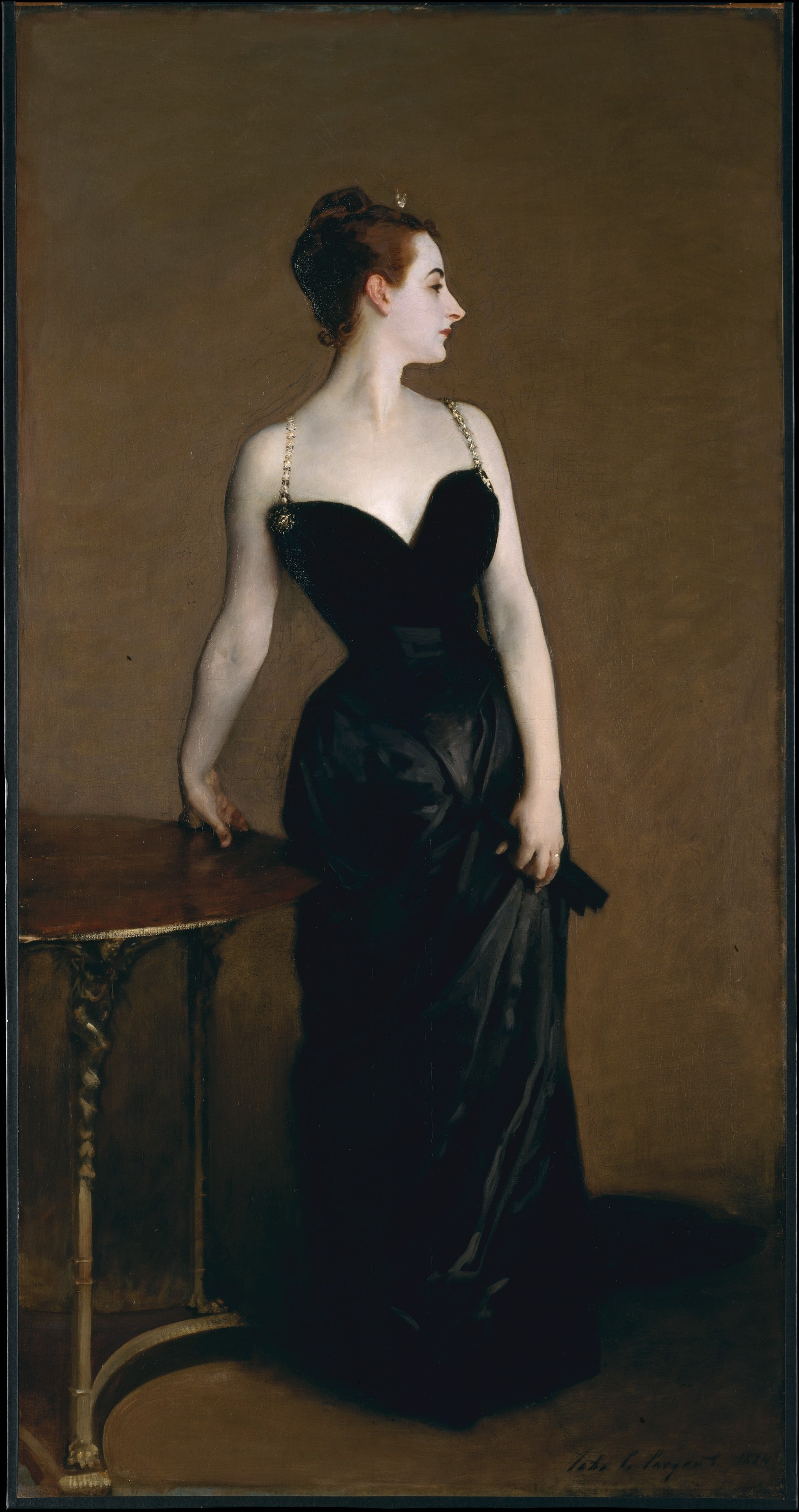
American? The Brussels critic wrote in 1879: “American by birth, French by brush.” Banned from Paris after training there and making friends—Monet, Degas, and Pissarro—he vanished from the European artistic radar. Too audacious in one painting, the portrait of Madame X? Retouched in an attempt to erase the scandal of a slipping strap, it now graces the exhibition poster.

This Salon virtuoso caused a scandal in 1884. Not just for the slipping strap and sensual pose—an invitation to debauchery?—but also for skin deemed cadaverous, artificial. And yet, what a masterpiece: pale skin with opalescent nuances against a black dress heightened by reflections that outline its distinguished cut. What haughty bearing, what personality in this profile emphasized by lips of supposedly vulgar red! Why did this offended painter then decide to leave Paris for London rather than join the Salons des refusés? The answer: “follow the money”! He indeed left Paris for London, where a more tolerant aristocratic clientele awaited and propelled him to the top.
The painting Mrs Henry White echoes Madame X. They could be called Mrs White and Mrs Black, both for the parallel conception and the opposition of their impact on the painter’s career.

Moreover, Mrs Henry White could fit into the #9 white challenge. Sargent brings transparency to the lace, shine to the satin, stiffness or fluidity to the overskirt and skirt. Behind her, the orange of the chair placed as a tonic color and echoed in the fan and on the lips creates eye circulation around the model. Subtle and effective.
Light
Sargent is not merely the painter of gilded transatlantic bourgeoisie. Certainly, these commissioned portraits were a source of income and impress by their number (nearly 900), but the painter’s talent shines equally in his personal research, especially in translating light.
For example, The Table under the Pergola, for its treatment of natural light. Admire the white tablecloth, spotted with sun that, traversed by it, turns ochre while reflecting rays from the beaten earth. And the glasses in the foreground: a few well-placed touches say it all—volume, reflections, and the irresistible urge to share an aperitif with someone.

As for The Birthday Party, it demonstrates mastery of artificial light as much as masterful composition dominated by a hypnotic red that strikes at first glance. One guesses a light source behind the man’s silhouette. Did he need to be anonymized to deserve such facial blur? Or is it simply a technique to focus attention on the female model, whose hair melts into shadow while her profile emerges.

The Blue Hour
At a time when John Singer Sargent was still little discussed, in the #7 challenge, the palette of the magic hour, I presented two works including Carnation, Lily, Lily and Rose, barely later (1885) and unfortunately absent from the exhibition.
Visitors can nevertheless savor this exquisite palette in the painting In the Luxembourg Gardens. It translates the enchantment of the gaze at that moment when blues gain brilliance, reds depth, and pinks softness. What a delight this stroll in the Luxembourg Gardens! Do you feel the evening warmth?

In the close-up below, appreciate the accuracy of the flower tones and admire how they rhythm the painting, passing through the lady’s fan.

European Inspirations
John Singer Sargent may have been born to American parents, but he did not set foot in America until age 20, in 1876. He spent his entire youth traveling in Europe and beyond.
Before Paris, he trained at the Accademia di Belle Arti in Florence. Beyond anatomy, composition, and classical drawing, he surely carried Michelangelo and Raphael’s teachings in his memory.
Presented at the Salon in 1883, The Daughters of Edward Darley Boit still intrigues today with its original composition, the gigantism of the Japanese vases, the little girls’ gazes, and the slightly bluish light in the background on the last third’s axis, opening the dark part of the painting. Doesn’t that remind you of something?

.jpg)
Who wouldn’t see the influence of Diego Velázquez (1599–1660) in his mythical painting Las Meninas? Sargent did not hide his admiration for this great Spanish master, making copies of several paintings. Here, he is criticized for an overly loose execution, perhaps too synthetic touches. Yet this style brings him closer to the Impressionists of his time.
Rhythms and Music
The painting Rehearsal of the Pasdeloup Orchestra at the Cirque d’Hiver will serve as a transition to the Kandinsky exhibition at the Philharmonie. Sargent was also a talented pianist. According to the exhibition notice, he was a regular at theaters and concert halls.

What place does this black-and-white painting have in a color chronicle? First, black and white are, of course, colors. But the remarkable point here is the play of contrasts created by these values. Look bottom left: silhouettes detached against the scores lead the contrast in a swirling dance. The dark instruments take over in the middle to soar into clearer notes higher up right. Perspective then stretches the scores in a centrifugal movement that calms in the rhythm of the tiered seats. What composition! Add vivid colors and you would have a Delaunay, created much later.
To Conclude Éblouir Paris
So why is John Singer Sargent so little known in continental Europe? The answer is simple: it is mainly the United States and Great Britain that have adopted and collected him. Fortunately, European and American institutions collaborate to present some works in exhibitions like this one. Let’s hope for more! Some will say Sargent was certainly virtuoso but not innovative enough compared to the Impressionists of his time. For my part, I am dazzled by his faculty of synthesis, his original compositions, his mastery of light.
Kandinsky
La musique des couleurs (The Music of Colors), the title of the exhibition at the Philharmonie, runs until February 1 2026. It highlights the fundamental place of music in Kandinsky’s life—his daily routine, his artistic calling, and his evolution.
Headphones playing mainly the music that marked the artist offer an immersive journey. This device brings us closer to the man himself. Kandinsky was a synesthete: auditory stimulation automatically and involuntarily triggered visual stimulation in the form of colors. So during the visit, you too will experience this dual stimulation: sounds and colors.
The scenography succeeds in immersing us in the total art that Kandinsky cherished. Here paintings, there a theatrical installation, further along an animation, then a cabinet blending personal objects and the painter’s tools (including his palette!), all steeped in the music of the century.

Color in Kandinsky’s Work
To explore color in Kandinsky through the works in the The Music of Colors exhibition, you can follow the immersive scenography of the Philharmonie… or choose another path. Adopting a chronological perspective makes it possible to grasp the slow and profound evolution that leads from figuration to pure abstraction—the one we most spontaneously associate with the artist. Although abstraction now dominates our image of Kandinsky, it represents the culmination of a long maturation—stylistic, technical, and spiritual. Each medium he explored (woodcut, tempera, oil, watercolor…) played a decisive role: by imposing its own constraints, it helped forge a distinctive style that Kandinsky consciously chose to preserve and carry forward into other techniques, even once those constraints no longer applied. So before going further, let’s look at how this process actually manifests in his work.
Pictorial Techniques
The Music of Colors exhibition offers a wide range of the pictorial techniques explored by the artist: woodcut, watercolor, tempera, oil on cardboard or canvas, at varying degrees of completion.
Kandinsky’s first wood engravings date from 1902. Woodcut requires playing with strong contrasts (black/white), managing negative (black) and positive (white) spaces, deciding what is ground and what is form—or sowing confusion between the two. The size and shape of the gouge used to carve the wood are additional constraints; they determine line thickness and textural elements. All of this can be perfectly observed in the engraving below from 1907.

The tempera paintings on colored cardboard presented in the Russia in Memory room seem to have incorporated the stylistic form found in woodcut. Indeed, the painter treats the cardboard ground as if it were wood: he leaves it bare in places, thus delimiting the forms. Occasionally, colored touches, like gouge strokes, create textural effects. This stylistic transfer can be observed, for example, in Song (1906).

Traces of black lines delimiting forms still remain in the oil painting Improvisation 3 (1909). Note the figurative forms treated rarely in flat areas, more often hatched. Shades often close to each other, like pink and red or nuances of blue, are thus juxtaposed within the form. Sometimes, in these hatchings, a strong contrast of tones: turquoise within a bright yellow, which recalls the contrast created by the turquoise rider. Many paintings from the same period bear this signature: very vivid and contrasted colors, hatchings, a few lines to distinguish the forms.

From Figuration to Abstraction
The stylistic periods of Kandinsky, as proposed by Selena Mattei in Art Majeur, are marked by his places of residence. They unfold like a taut thread from figuration to pure abstraction, preceded by an incubating period.
Youth
Kandinsky’s youth, between Odessa and Moscow, seems to have nourished his artistic soul.
Kandinsky (1866-1944), born into a cultivated bourgeois family, was introduced very early to drawing and painting. Music was also part of his education. From the age of eight he studied solfège and piano. Later he would take up the cello, but drawing remained his first passion.
Do you remember your travels at the age of three? Kandinsky, for his part, said he was impressed by the colors and images of the great Italian cities he visited. It was also color that fascinated him when, every year during his adolescence, he went to Moscow with his father.
He nevertheless embarked on law studies, as his milieu presumably expected—studies that he enjoyed. In 1889, at the age of 23, on an anthropological expedition to the Vologda province, 470 km north of Moscow, he filled notebooks with sketches. He immersed himself in colors, folk music, popular culture. Artistic concerns already seemed as important to him as the scholarly purpose of his trip.
The Shock (1896)
During an Impressionist exhibition in Moscow in 1896, Kandinsky discovered Monet’s haystacks. In reality, he did not see haystacks but an explosion of colors detached from any object.
In December of the same year: the shock initiated by the Monet paintings repeated itself, even more intensely. At a performance of Wagner’s opera Lohengrin, Kandinsky experienced one of his most powerful synesthetic moments: the sounds transformed into colors to the point of dazzling and overwhelming him. This man who would have become a professor of political economy at the University of Dorpat then decided to embrace the career of painter. He enrolled in artistic studies in Munich.
Thus Kandinsky came to pictorial art rather late, in his thirties. His first work—identified as such—The Port of Odessa, presented as a preamble, dates from 1898 (he was 32). Clearly, he knew how to paint.
Early Period
This shock thus inaugurated the early period (1896-1908), known as the Munich period, identified as the first characterized by a personal style. This period features figurative paintings influenced by Impressionism and Post-Impressionism—landscapes and urban scenes rendered in vivid colors, yet still anchored to observable motifs—alongside the woodcuts shown earlier and the tempera works.

In this sketch, the woodcut-derived style is evident above all in the deliberate preservation of bare areas on the ochre canvas, as described earlier in the Pictorial Techniques section.
This period is also marked by encounters that seem decisive to me. Here is a biographical excerpt:
- 1897 Enrolled in Anton Azbé’s school. Met Jawlensky.
- 1900 Student of Franz Stuck at the Royal Academy of Munich at the same time as Paul Klee.
- 1902 Taught at the “Phalanx” school where Gabriele Münter was his student.
From 1903 onward, Kandinsky and Gabriele Münter undertook numerous trips: Vienna, Venice, Odessa, Moscow, Berlin. Together, in Paris (1906-1907), they discovered the avant-garde: Matisse and the Fauves, heralding the next period.
Fauve Period
The German period known as Fauve/Expressionist (1908-1914) is characterized by a chromatic explosion, simplified and expressive forms, and the birth in 1911 of the artists’ group Der Blaue Reiter.

I particularly like the paintings (1908-1913) inspired by the Bavarian Alps near Murnau, where Kandinsky acquired a house. In this one, almost every line defining a form has disappeared. Even more audacious, certain parts blend into the background: the hollow of the back and the cow’s neck no longer have any boundary, so that the cow does not appear directly. We move further and further away from reality: what cow would be spotted with khaki, bright yellow, orange, or purplish red?
Music as a Model
In 1911, during this same period, Kandinsky wrote On the Spiritual in Art, and Painting in Particular, a theoretical work on art. He notably sets out the connections between painting and music.
Kandinsky distinguishes three categories of works according to their degree of subjectivity and spontaneity: impressions, improvisations, and compositions.

_-_Google_Art_Project.jpg)
Impressions (1909–1912) are immediate reactions to what presents itself to him: landscapes, concerts, events. Forms are still recognizable but stylized, color and line dominate the motif. In Impression III (Concert) of 1911, one recognizes the piano and the audience once familiar with the sketches below. Is the music that large yellow mass? No matter, we enter abstraction.

Improvisations (1909–1914), for their part, are the spontaneous expression of internal, unconscious, even spiritual emotions. They are dynamic abstract forms, but residual narrative traces persist, such as the tree in the painting below.

The painting entitled Fugue is referred as a controlled improvisation, according to a handwritten note by the artist.

Compositions (1910–1939), on the other hand, are complex, matured, elaborated syntheses with preparatory sketches. They express a deep “inner necessity.”
The Apocalypse (All Saints) series, created between 1911 and 1914, is part of these compositions. It expresses the artist’s spiritual anxiety but aims to be positive. It announces the end of materialism and the advent of a new spiritual age through abstract art. Personally, in the painting below, I see more a colored chaos than an optimistic synthesis.

Kandinsky would continue to create Compositions in his later stylistic periods.
Beyond these formal categories, Kandinsky thinks of color “as music,” rich in analogies (timbre, registers, chords)—though his synesthesia avoids any rigid chromatic solfège, remaining a personal inner cartography, fully coherent for him. Yellow, for instance, resonates with the bright, often aggressive tone of a trumpet; deep blue, with a cello or the profound shades of an organ.
Total Art
In 1911, alongside this same Fauve/Expressionist period, Kandinsky co-founded the Der Blaue Reiter (The Blue Rider) group with Franz Marc. This led to a true editorial project of total art: the Almanach du Blaue Reiter (1912), which brought together essays, reproductions of works from various eras and cultures, musical scores, and more—an anthology reflecting a shared spiritual conception of art across disciplines. The exhibition includes a film on the genesis of this almanac.
In parallel, and as a deeply personal counterpoint to the collaborative spirit of the Almanach, Kandinsky conceived Klänge (Sounds / Resonances, 1913), an artist’s book that functions as a poetic manifesto. It comprises prose poems written entirely by him, set in carefully designed typography and accompanied by his own woodcuts—all working together as a visual score that directly mirrors his synesthetic experience. Through the rhythm and sonic quality of the words in his poems, combined with the visual impact of the prints and page layout, Kandinsky seeks to share this synesthesia with the reader, inviting them to perceive the fusion of sound, word, image, and color as he does: total art embodied in the form of a single book.
Below is one of these colored wood engravings from Klänge, depicting a rider—an element dear to Kandinsky and a recurring figurative motif in his work.

Kandinsky also explores the synthesis of theater–painting–music during this period. The watercolor below, for Violet (Picture II) (1914), bears witness to this quest. Note that in the Centre Pompidou digital version, the form intended to be violet clearly shifts toward garnet—a noticeable chromatic discrepancy which strikingly contradicts the very title of the work! With watercolor, Kandinsky develops a distinct style: forms outlined in India ink, given volume and depth through colored gradients that emerge naturally with the addition of water. He would later adopt this same principle in his oil paintings.

But the war turned everything upside down: forced to return to Russia in 1914, Kandinsky entered a more restrained and geometric phase.
Russian Period (1915–1921)
The outbreak of the First World War brought an inevitable rupture—not merely emotional, but concrete and inescapable. Forced to leave Germany, Kandinsky returned to Russia. This marked the beginning of his Russian period (1915–1921), during which his works became more geometric, influenced by constructivism and suprematism. Nevertheless, burdened by numerous cultural and administrative duties, Kandinsky’s output diminished noticeably. Figuration also re-emerged in his work, as can be seen in the watercolor below.

In 1922, an invitation to join the Bauhaus reignited his creativity in a new and stimulating environment.
Bauhaus Period (1922–1933)
Kandinsky is thus called to teach in Germany at the Bauhaus, an avant-garde school of architecture and applied arts. Under political pressure, the Bauhaus moved several times: from Weimar to Dessau in 1925, then to Berlin in 1932, before being dissolved in 1933. Kandinsky followed along.
The Bauhaus Period (1922–1933) is marked by strict geometrization (circles, triangles, straight lines), initially pure colors then more subtle ones, compositions influenced by Klee and Mondrian, but always expressive and musical.

Still within this conception of total art, Wassily Kandinsky designed in 1928 the Pictures at an Exhibition, an abstract staging of Mussorgsky’s piano suite. Kandinsky created sets, lighting, and mobile geometric scenic movements (colored forms: light green, white, crimson, black, ochre) that translated each of Viktor Hartmann’s pictures into dynamic abstraction, synchronized with the music. Color, light, and sound merge, putting into practice the theories from On the Spiritual in Art adapted to pure geometry.


The closure of the Bauhaus by the Nazis in 1933 forced him into definitive exile in Paris, where his pictorial language finally opened up to greater organic fluidity.
Parisian Period (1933–1944)
The rise of Nazism then drove him into exile. The Parisian Period (1933–1944) sees the appearance of organic biomorphic forms, fluid and surrealist. Did his meeting with Miró in 1934 contribute to this stylistic evolution?
Darker colors, floating cosmic forms now characterize his pictorial world, less constrained by geometric rigidity.

Kandinsky: further materials
(English adaptation of this section kindly provided by Grok. Pour la version originale en français, rendez-vous ici)
The exhibition press kit (in English) is available here: Press release – Kandinsky. The Music of Colors. It includes the musical playlist, scenographic details, reproductions, and room-by-room texts—perfect for deepening your understanding of the show.
For a solid educational overview, the Centre Pompidou’s 2009 dossier on Kandinsky has an English version here: Vassily Kandinsky – Monographie (English). It features excerpts from Kandinsky’s writings (including Concerning the Spiritual in Art), precise biographical details, illustrations, and collection history—highly recommended for its clarity and depth.
Key English-language resources include:
- The Guggenheim Museums and Foundation – Extensive Kandinsky holdings with excellent online materials: biography, key artworks (including many Compositions), teaching resources, and exhibition history. Very useful for visual analysis and context on his abstract evolution: Vasily Kandinsky and Teaching Materials: Kandinsky.
- Tate (UK) – Concise biography, high-quality images of major works (e.g., Swinging, Cossacks), and interpretive articles: Wassily Kandinsky 1866–1944. Great for quick overviews and connections to British collections.
- The Art Story – Well-organized biography, influences, key ideas, and useful videos/articles on his life and abstraction: Wassily Kandinsky Paintings, Bio, Ideas. Accessible and synthetic.
- WassilyKandinsky.net – A comprehensive site with over 600 artworks (including Compositions, Improvisations, Impressions), biography, rare photos, quotes, and links to his books: Wassily Kandinsky — 614 artworks, biography, books, quotes, articles. Excellent for browsing visuals and primary sources.
For his theoretical writings in English:
- Concerning the Spiritual in Art (full English translation available online or in print editions, e.g., via Guggenheim or Internet Archive).
- Kandinsky: Complete Writings on Art (edited by Kenneth C. Lindsay and Peter Vergo) – collects all his published texts on art.
Finally, for audiovisual content in English, search YouTube for high-quality shorts like “Can you see music in this painting? How synaesthesia fuelled Kandinsky’s art” (Aeon Videos / Listening In channel) or “What’s the Sound of Colour? Kandinsky and Music” – they explore his synesthesia and musical influences with visuals and narration.
Conclusions
Two remarkable artists, but so different, in this first article of 2026. One, John Singer Sargent, a virtuoso of the brush from his earliest youth, immersed very early in the international art scene, undisputed master of light and society portraiture. The other, Wassily Kandinsky, an outstanding theorist and innovator, who came to painting late in life, and who sought to name and theorize the artistic experience as a vehicle for the deepest aspirations of the soul. Both, in their own way, knew how to master the networks and means of communication of their time to make their vision shine.
So here are two beautiful exhibitions not to be missed:
- The one dedicated to John Singer Sargent at the Musée d’Orsay (ended in January 2026) offers much more than a retrospective: once in this magnificent setting, you have access to all modern and some contemporary art in the museum.
- The one dedicated to Kandinsky at the Philharmonie de Paris (until February 2026) goes far beyond a painting exhibition: it is a true immersion in total art according to Kandinsky, where color, music, and spirit merge. And if it “took you for a walk in an unknown world,” then the artist has fully succeeded in his bet.
In the end, the simple prism of color chosen for this article is only a modest entry point. Hoping that it inspires you to cross Paris this January, to dive into these two major figures in art history, and perhaps to come back and explore other facets of their work.
Acknowledgments: Thanks to Perplexity AI for extensive research help and reliable Kandinsky references, and to Grok for translation assistance. All final content and interpretations are my own.